

 What happens if the customer doesn't like a printed reproduction, even certified? Maybe it's too flat, too hot, too cold, and so on?
How many times the customer seeing a printed job result says: "Yes, this is what we wanted, but ...". Another legitimate question is: "What is the purpose of a high-quality printout?"
The goal of the system described in this article is to obtain quality prints, so that the customer agrees and says, "It's nice, I like it, I buy it (therefore I pay for it). "

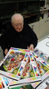 But then what are the certification process? Let's analyze the problem with the help of an expert who has dedicated his life to the study of color color, Professor Pietro Chasseur of San Zeno Institute in Verona.
Matter of perception
The current certification process evaluates the quality with a technical approach, so if the paper and ink have colorimetry as well as TVI tone curves within certain values, "quality is guaranteed." This may seem correct, but the problem that arises eventually is if the customer dislikes the result, because it is not what the customer expected. Many would agree.
An example: the customer prefers warm or cool color tones? According to analytical studies, for example, Nordic people as in north of the Alps, prefer cool tones. Southern people tend to prefer warm color tones. How about the United States? Or Japan? There is no deltaE that takes. What matter at the end is visual perception. So while the international system of certification bases evaluation on the delta E, the customer bases his evaluation on perception, which is typically subjective.
Current image processing systems for printing are mainly oriented to reduce the amount of ink used, therefore controlling the black channel in order to save ink. The result is a print with flat images. Wouldn't be possible to give the images volume and tridimensionality, along with color fullness and brightness, and color definition?
Professor Pietro Chasseur, a worldwide well-known color scientist, explains in detail how to handle the color according to a new technology focused on sustainability and money savings. Only by pursuing this goal you can get the right price required to meet current market demands. A choice that Prof Chasseur calls "ethical and sustainable."
System fundamentals
The foundation of the study and the results of this research - which led him to develop Système
Chromatique ® - is the concept of a sustainable communication process, high-end color management for prepress and digital or conventional printing (which improves quality by simplifying the color management), the classification and evaluation of the qualitative rendition of raw materials consumption while reducing production costs.
 In pre-press, before the Imposition, Système Chromatique processes and converts images with a single universal profile valid for any printing process (digital, offset, flexo, etc.). Subsequently, in print, Système Chromatique interprets the measured data indicating corrections to be performed to ensure the repeatability. In addition, it supports the experiences of the past to make the industrial management of color more economical, repeatable, easy, fast and qualitative.
To hear these definitions one may be perplexed: it seems to be a solution so innovative that it simplicity of application would appear unlikely.
However Prof. Chasseur explains that, in the graphic arts industry, the current (best) way of working has remained rooted in the classic method which, quite rightly, is based on the "technique". To fix the raw materials such as paper, ink, print curves and characterizations (from
which are derived ICC profiles) as references... What are the basic parameters of the "technique"? The density and dot gain, which the industry follows for over forty years, the CtP and compensation curves that are in use for over fifteen years. Furthermore, in the last ten years, everyone follows the ISO 12647 norm, which is based on CIELab color system.
Following these principles, the quality is guaranteed by measurements in the sense that if the measurements within the set parameters, the quality of the printed product will be assured.
Yet, to whom hasn't happened that a printed outcome that complies technically has not been accepted by the customer? Why?
This often happens because the customer is not a technician and therefore does not use technical quality assessment methods. The client expresses a qualitative judgment based on a criterion of
evaluation of the quality as it visually appears. It is based on the perception or feeling,
even if, however, somewhat subjective.
For this reason and in order to reconcile perception and technique, Système Chromatique therefore has its own method of quality assessment in accordance with the method of subjective judgment of the customer. And this is the interesting part, because the method is not absolute, but rather based precisely on preferences statistics, groups of people (customers), generally depending on the region or industry sector which they belong to. Moreover, it is known and accepted that those who work in the fashion industry has a different concept of color from those who work in the field of furniture or magazines or books.
The operation of the system Tristimulus
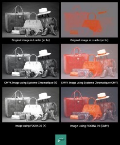
To overcome these subjective differences Système Chromatique is based on the vision "Tristimulus" CIE 1964 Standard Observer, which separates the image component (L *) from component color, chroma (a, b).
The image component incorporates the major quality of the reproduction of reality: design/readability; detail/definition, gradation, contrast, volume and tridimensionality.
The black channel of the color separations made by Système Chromatique incorporates the above parameters of quality picture definition and sets as a reference for quality the photographic color space "Photogamut RGB", which shows how the ISO 12640-3 reference quality
and which represents the best qualitative yield of color reproduction that can be obtained with a printing process. Offset printing has always tried to imitate this color space, but didn't really
succeed yet.
Quality accessible to everyone
Système Chromatique world premiered online early in June 2013.
Photographers, designers, graphic design studios, companies pre-press and printing, can now register online and via an automated service that reminds WeTransfer ®, can optimize their images or work, regardless of the devices, print media, inks and printing processes
subsequently used. After the image processing is complete, the system will send a link to e-mail used during registration, allowing them to download the optimized images with a quality performance superior to the profiles so far applied, therefore high detail and definition, brightness, contrast, greater volume and tridimensionality.
Système Chromatique can be easily integrated into existing workflows of pre-press (preflight,
imposition, ripping, CtP). It simplify workflows by eliminating errors and therefore allowing
paper savings up to 50%, ink savings up to 30% and make ready savings up to 50%. Furthermore, it ensures image and color repeatability independently from the paper, ink, printing process, workflow or printing technology used, or native file.
In short, Système Chromatique is a real révolution that many creative and some well-known printing companies in Europe are already using in their companies and workflows, simplifying their lives, improving their work results, and thus increasing their profits.


